UX research and design for mobile app for one-time and recurring orders at Florist.
The product
Mobile app for one-time and recurring orders at Florist. Target users are teenagers and adults, who buy bouquets for any occasion and with every frequency.
Project duration
April – June 2023
The problem
Users who buy flowers struggle with the problems of seasonal variation of flower types and long time to complete the order on site. Customers interested in recurring orders also need a lot of time and effort to buy flowers repeatedly.
The goal
To make ordering flowers a simple, time-saving and stress-free experience.
My role & responsibilities
UX designer & researcher – user research, wireframing, prototyping.
User research
User research was conducted in the aim to find users problems, needs, behaviours and motivations. The participants of the interviews were adults from two customer’s groups: who buys flowers occasionally and those who makes recurring orders.
Research showed that users struggle with the problems of seasonal variation of flower types and long time to complete the order on site. Customers interested in recurring orders also need a lot of time and effort to buy flowers repeatedly.
Digital wireframes
Paper wireframes were created as the first design step for the app. Then, there were tested on users and transformed into the digital ones.
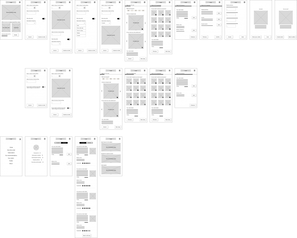
High-fidelity design
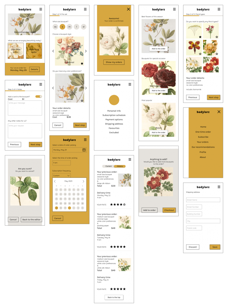
High-fidelity Mobile prototype for an app.
Usability study
The moderated research was conducted on site, in Poland, on group of 5 participants in the time of 15-30 minutes.
Usability study showed, that users liked the idea of florist app, but asked or need some changes in design. All of their suggestions were implemented in next versions of design. Findings included insights:
- date picker and image carousels were confusing,
- date picker was confusing,
- more complex order settings are wanted,
- some components needed replacement.
Accessibility considerations
Color contrast was checked and passed the WCAG requirements.
Screens are simple and clean, easy to use for users with assistive technology, such as those with limited mobility or visual impairments.
Every interactive element has a negative space around it to prevent accidental clicks.
Impact
During the usability test some users said, that they would certainly be using this app, if only it was available.
What I learned
I learned a lot about UX design in general. I think the most important thing is that the user can always point out something about the design that the professionals have not thought of.
Next steps
- Further usability test and design changes.
- Adding more functions, such as import of existing documents.
- Creating a web page.