UX research and design for a website for finding apartments to buy or rent.
The product
The project aimed to design a user-friendly and engaging website that would help potential buyers and renters find their ideal apartments.
Project duration
July 2023
The problem
The problem I tried to solve during the design process was the uncomfortable feelings of users at such important moments in their lives, such as the search for a new home for them and their families. Users struggled with the low-quality search and filter options, which consumed a lot of time and were nowhere near the feeling of joy and excitement.
The goal
The aim of the project was to create solutions that would enable people to conveniently acquire the knowledge they need to make an informed and satisfactory purchase, review the available offers and obtain the necessary information to take further steps.
My role & responsibilities
UX designer & researcher – user research, wireframing, prototyping.
User research
Potential users can be assigned to two groups: those looking for a place to rent and those buying their own property. Both groups are adults, with diverse backgrounds, employment and family or roommate groups.
Users were identified through interviews with people from both sides: tenants/buyers and owners.
Digital wireframes
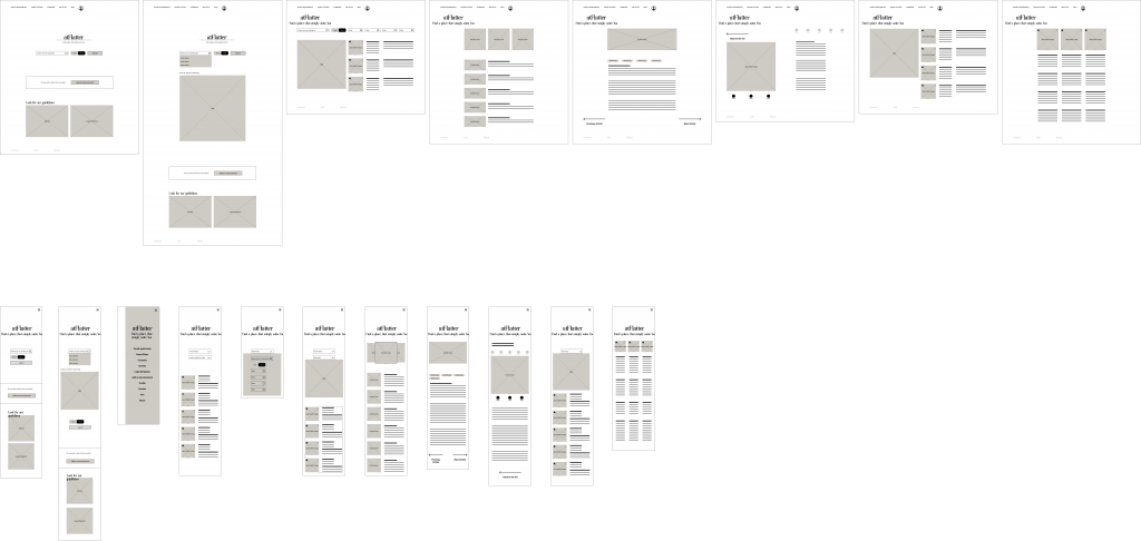
The aim of making wireframes was to find a website structure that would accommodate the required information and allow users to quickly access and use the data.

High-fidelity design

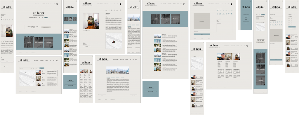
Landing page for Desktop and Mobile.
Usability study
The unmoderated research was conducted remotely, worldwide on group of 10 participants in the time of 30-45 minutes.
Usability study showed, that users liked the idea of resume builder, but asked for more features. All of their suggestions were implemented in next versions of design. Findings included insights:
- more filter options needed,
- add an option of adding an announcement.
Accessibility considerations
Color contrast was checked and passed the WCAG requirements.
Screens are simple and clean, easy to use for users with assistive technology, such as those with limited mobility or visual impairments.
Every interactive element has a negative space around it to prevent accidental clicks.
Impact
During the usability test some users said, that they would certainly be using this website, if only it was available.
What I learned
I learned a lot about UX design in general. I think the most important thing is that the user can always point out something about the design that the professionals have not thought of.
Next steps
- Further usability test and design changes.
- Adding more functions, such as import of existing documents.
- Design a Mobile app.